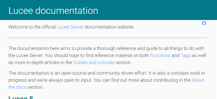
I’ve done a lot of work speeding up and improving the docs over the last few weeks
If somebody is good with css and fonts etc and would like to get involved, there’s a little bit of tuning and updating required
update the fonts (material design, roboto and font awesome), preferably add in a reduced build, including only the icon fonts which are used
fix the font flash on load, i.e try Struct :: Lucee Documentation
You can find all the related code here
isapir
April 9, 2018, 3:22pm
2
The CSS for the font sizing should be “fluid” for better responsiveness. See Fluid Typography | CSS-Tricks - CSS-Tricks
isapir
April 9, 2018, 7:44pm
3
p.s. Recommended watch: - YouTube
(not sure why there is no preview)
looks like something changed with the google roboto font used for the docs?
nothing has changed server side recently, but it’s now much thinner and harder to read, any ideas?
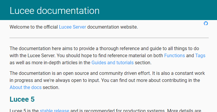
It seems to be ok for me in Windows 10, I’ve tested in Edge and Chrome 66 and both render the font the same, font weight seems to be a bit heavier than your screenshot:
Which OS / browser are you using?
Interestingly, Discourse does also optimise/re-process images after hitting the “Reply” button… so the above screenshot looks a little worse than it does when it appears directly on my screen.
win 10, chrome stable and canary, but only on my desktop, laptop looks fine (same combos)
Did you install the Roboto (TTF) font onto your system? That could perhaps give you different results to the web font?
If all fonts were a problem then you could run the ClearType wizard, but if it’s just this one font then I can’t think of any other reasons.
nup, roboto isn’t installed locally
I did just update both intel and nvidia drivers, a reboot didn’t help
anyway, if anyone else sees this problem, chime in
it’s changed on my laptop too, just found this bug report
opened 11:27AM - 18 May 18 UTC
I Font Bug
Hi,
We are using Roboto font for our most of the sites. Suddenly all of them … have issues with the font. But only in chrome. Firefox rendering them fine. I tried developer.android.com as well where they are using Roboto font. There too i see the same issue. Can someone help to resolve it?
Screenshot is taken by rendering this page https://developer.android.com/topic/performance/vitals/frozen


