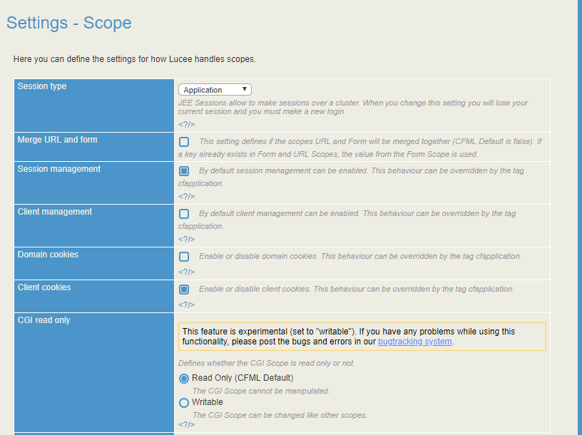
What do people think about giving the appearance of the Administrators a 2018 reboot?
- replace the italic dark grey on light grey background info text with more readable darker non-italic text?
- remove the rounded corners?
- contextual help links
- remove the background image and use more of the page for content?
- switch from tables to responsive css?
- move away from checkbox to select actions, still keep them for bulk actions, but make the title/name a link to open/edit? maybe a reusable table module with sorting etc
I’m not a big fan of the new 2018 admin UI, but I also just don’t like change so there’s that… The new 2018 admin feels like it’s harder to find stuff to me and it also has some annoying CSS issues where it scrolls horizontally off the edge of my 4:3 monitors.
FWIW Micha has been changing the background on the login screen every minor release just to refresh the look a little. I’m all for a UI refresh but I think it’s one of those things that takes a lot of time and provides little real benefit of than breaking the monotony. Usually when topics like this come up (the other variation is “we should rewrite the admin in a framework!”) Micha’s response is “Great, go ahead and do it and send it to me when it’s 100% complete”. To date, no one has ever actually taken the time.
I do hesitate to spent much time on the admin when I think Lucee needs to be moving towards CLI tooling and other external means of configuring, but nonetheless your ideas above look good and don’t involve any sort of total rewrite so perhaps they could be piecemealed in.